IDENTITY
LOGO
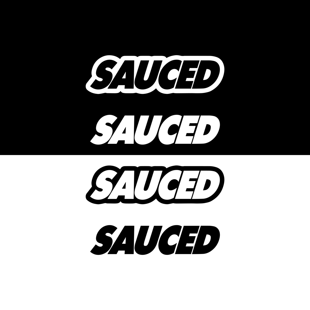
The SAUCED logo is a dynamic representation of our brand identity, capturing the essence of culinary creativity and flavor exploration. At its core, the logo features a sleek and contemporary typeface that conveys modernity and sophistication.

THE DRIP IS DIFFERENT
COLORS
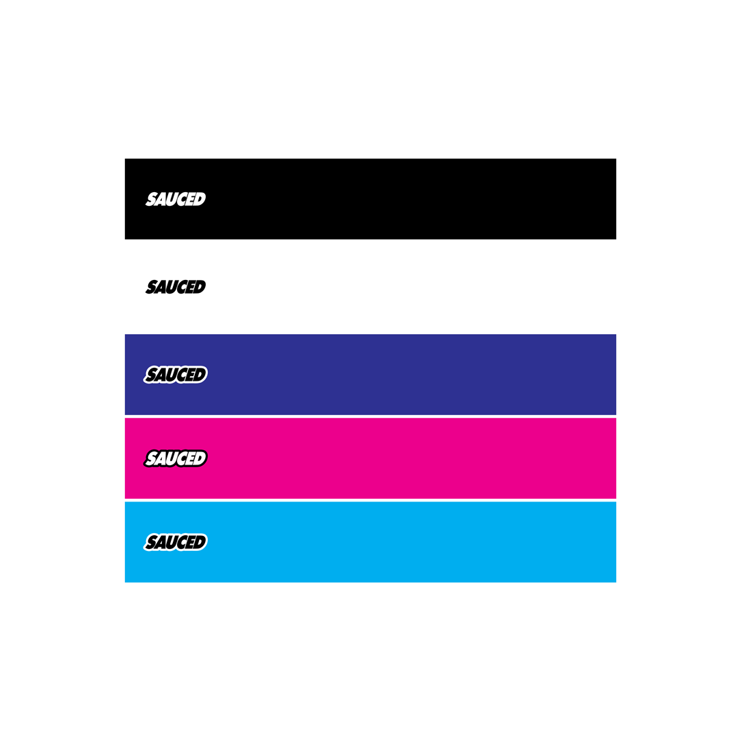
SAUCED embraces a vibrant and distinctive color palette that plays a pivotal role in defining our brand identity.

IMAGES AND VIDEOS
MEDIA
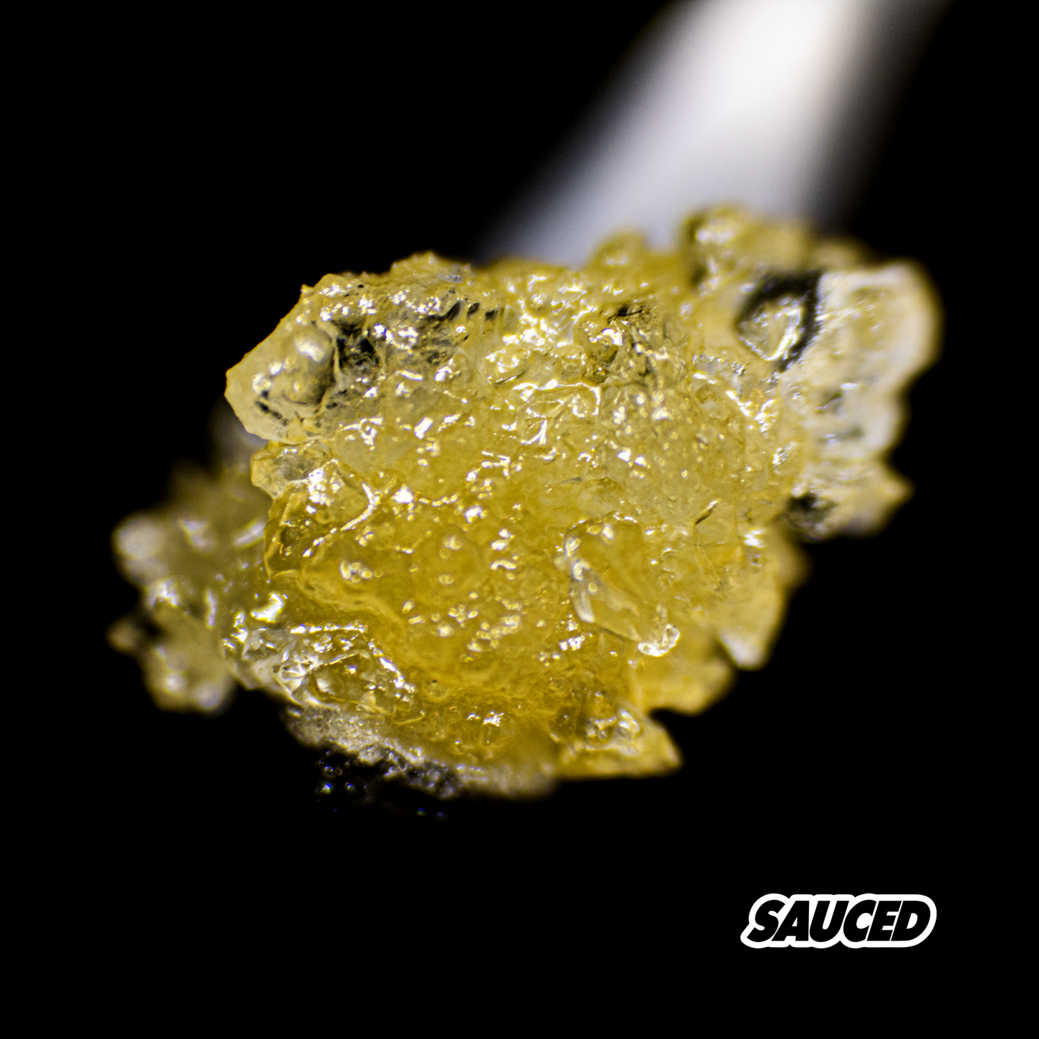
SAUCED places a strong emphasis on visually appealing and captivating product media as a cornerstone of our brand assets. These media assets, including high-quality images and videos, play a pivotal role in showcasing how THE DRIP IS DIFFERENT.
